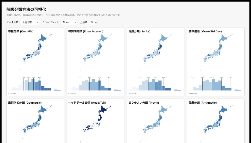
This interactive content compares classification methods used in GIS and choropleth maps against the same data. You can view quantile, equal interval, natural breaks (Jenks), standard deviation, geometric interval, head/tail breaks, pretty breaks, and arithmetic progression classifications side by side.
The data distribution can be switched between uniform, normal, right-skewed, and bimodal patterns, making it easier to see how the shape of the data changes the resulting classes. Color palettes and the number of classes can also be adjusted, so the demo works well as a learning tool for understanding how classification affects map representation.
